
The project focused on creating a comprehensive design system to support CarGurus’ rebranding efforts. As the Design Systems Manager, my role was to lead the creation of a full library of branded components and collaborate closely with the development team to implement these components effectively. This required not only redesigning core elements but also ensuring that every component met the latest accessibility standards.
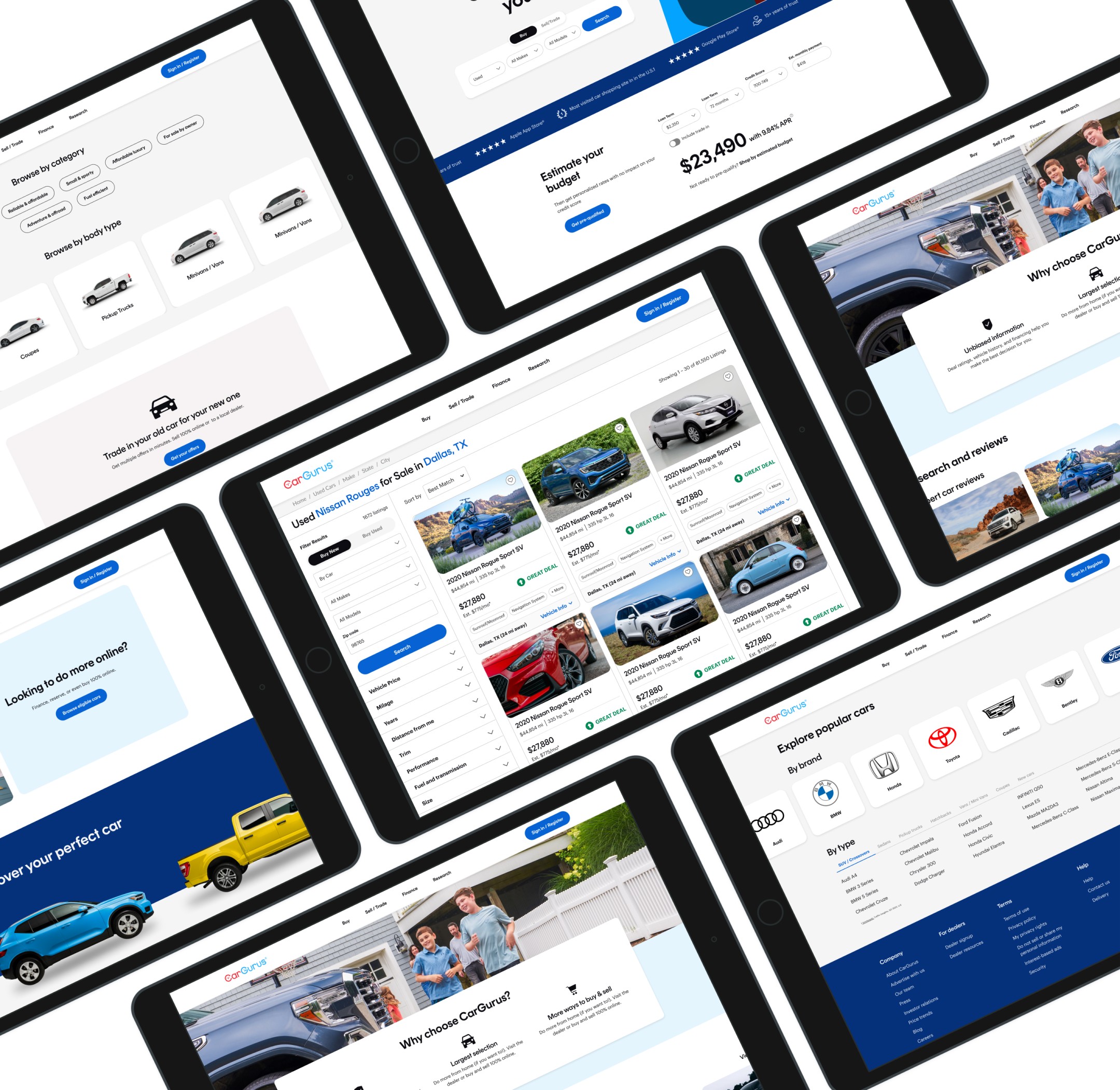
Concrete HomePage

BackBay HOmePage
Typography
Establishing Visual Hierarchy
The typeface selection for Chassis Backbay focused on achieving a balance between readability and brand consistency. We chose Rund Display and Graphik for their clean, modern sans-serif forms, which ensure excellent legibility across different screen sizes and devices. With a range of weights and styles, these typefaces offer the flexibility needed for various applications, from impactful headlines to clear body text. This updated typography establishes a strong visual hierarchy, enhancing the overall user experience while reinforcing the CarGurus brand identity.
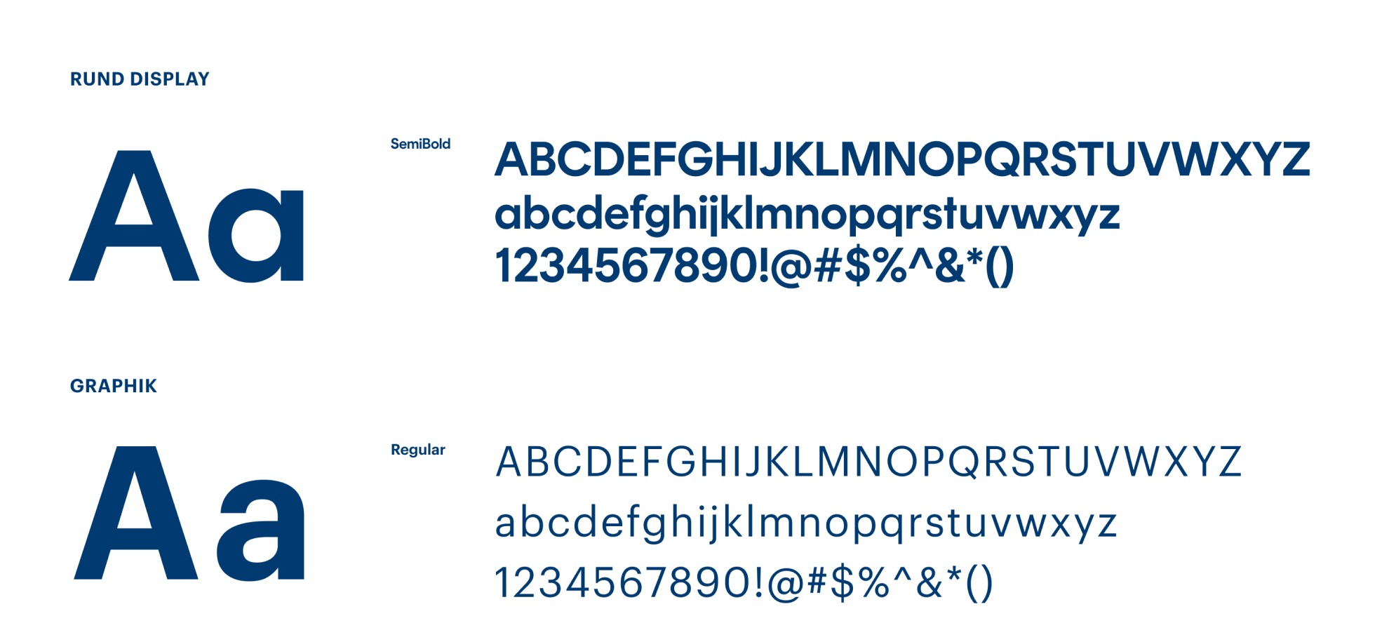
Creating Type Tokens
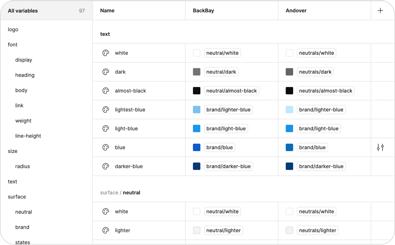
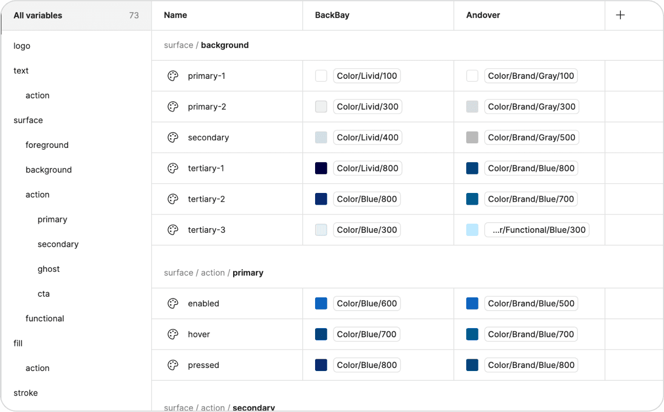
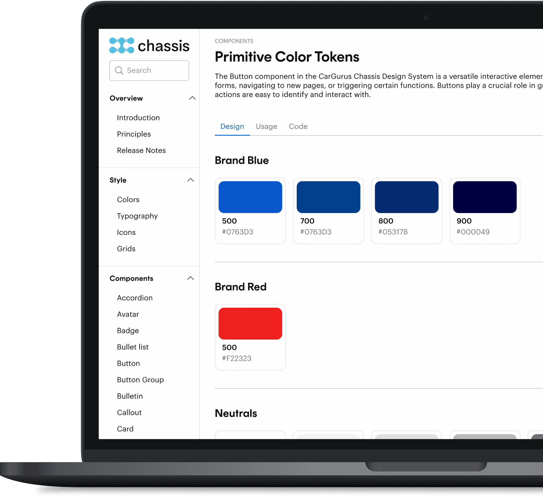
Crafting a Bold, Accessible Palette
The Chassis Backbay color system was designed with accessibility and flexibility in mind. We introduced a set of color tokens that provide a cohesive palette for all components, including support for dark and light modes. Each token is named semantically (e.g., “primary-bg” instead of “blue-500”) to allow for easy updates and adaptations in future iterations. This approach ensures that the design system can scale while maintaining a consistent look and feel across the platform.

Semantic Naming
Laying the Foundation for Scalability
The semantic naming strategy was developed to improve collaboration between design and development teams by creating clear, descriptive names for each component. By moving away from appearance-based names like “blue-button” to functional names like “primary-button,” we ensured that each component’s purpose was easily understood. This approach supports the transition between design systems, such as switching from Andover to Backbay, and allows for seamless adaptations to new modes like dark mode.
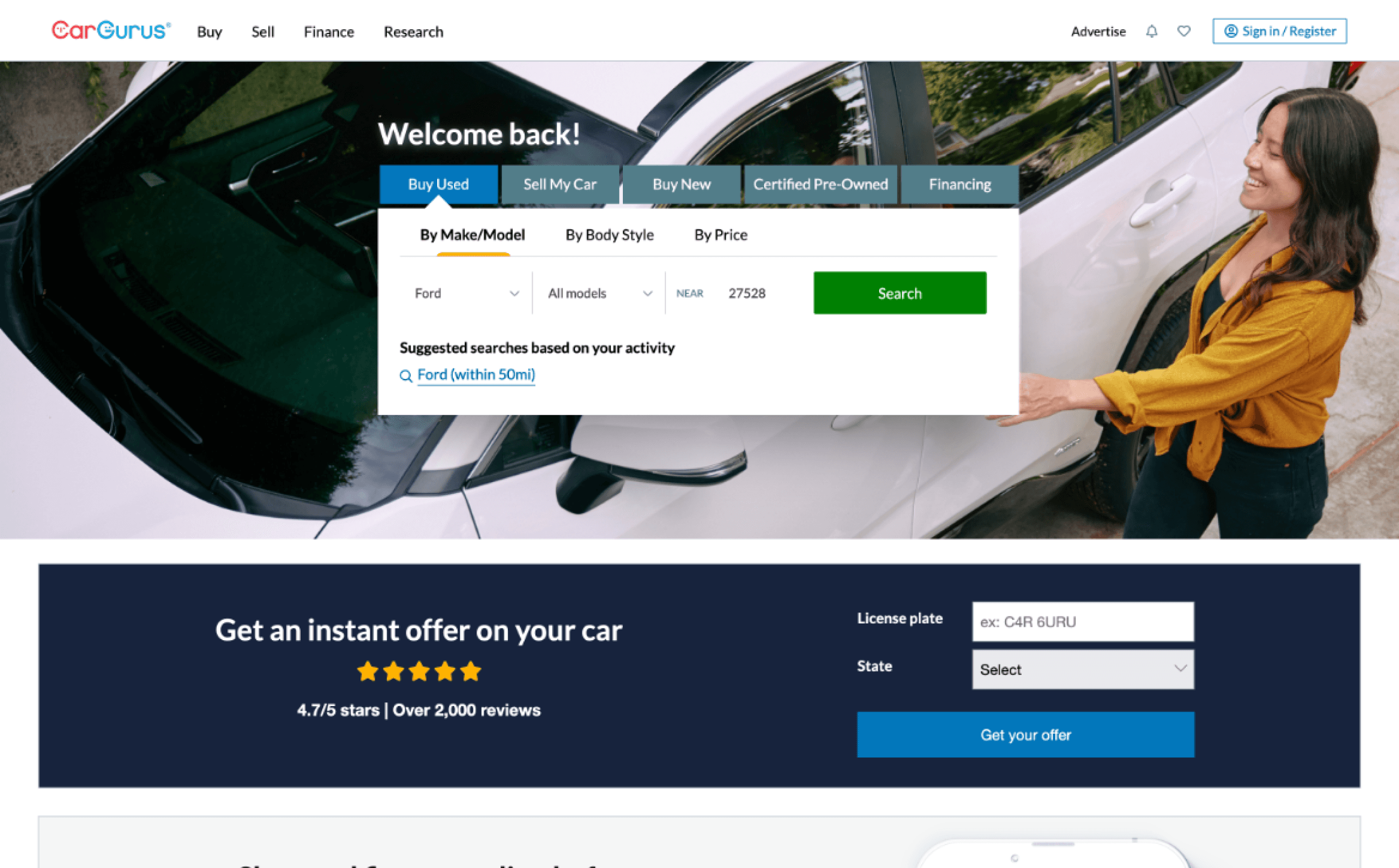
Concrete HomePage
BackBay HOmePage
Components
Building the Foundation
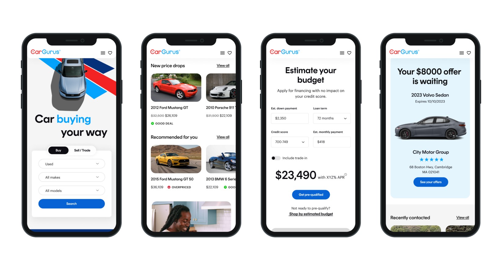
The Chassis Backbay design library includes a full set of accessible components, from buttons and form inputs to complex layouts and interactive elements. Each component was designed with inclusivity in mind, ensuring that all elements are navigable by keyboard and compatible with screen readers. The library is maintained with a detailed documentation system that guides designers and developers on correct usage, helping maintain visual and functional consistency across all CarGurus products.

How Chassis Backbay Adapts Seamlessly Across Devices
Chassis Backbay’s responsive variable properties enable designers to create components that work across multiple breakpoints, from desktop to tablet and mobile. Using Figma’s variable properties, we ensured that every component is responsive by default, reducing the need for duplicative design work. This approach also helps maintain a consistent look and feel across all screen sizes, providing a cohesive user experience.
From Design Debt to Design Excellence
Measuring the Impact of Chassis Backbay
The implementation of the Chassis Backbay design system resulted in significant improvements across the organization. Design debt was reduced by 40% due to reusable components and standardized naming conventions. Development time for new features decreased by 30%, enabling faster launches and quicker iteration cycles. Additionally, user satisfaction increased by 20% as a result of a more consistent and accessible user experience. The Chassis Backbay design system has now been fully adopted across CarGurus’ design and development teams, with 95% of all new components created using the system.